Riveter is a platform that helps those who lost their jobs during the COVID outbreak giving them access to unemployment guidance, heath insurance tips, and free/discounted resources. You can read more about it in my previous case study.
When we were still in the initial research phase we understood that governmental forms and online applications just don't work. During the first critical weeks of the pandemic, millions of people lost their jobs and they were not able to register as unemployed because the American system wasn't prepared for this amount of people.
Systems were crashing, mailed applications were lost and phones just died. It was a huge mess and in the center of it stood our user - uncertain, scared, and lost.
Systems were crashing, mailed applications were lost and phones just died. It was a huge mess and in the center of it stood our user - uncertain, scared, and lost.
We wanted to help them apply for benefits as fast as possible and make sure they take care of their health insurance.
That's how we created an Application for unemployment benefits.
The process
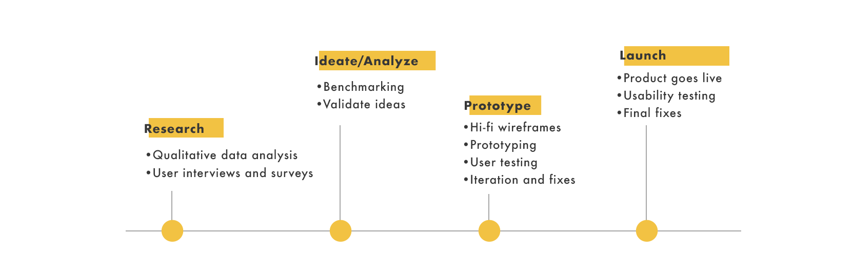
Research
Based on our research for the platform, we knew what problems our users are facing. As a startup, our job was to create a simple solution for people who lost their jobs. We knew that applying for unemployment was a hard and tedious process in many states. On top of that people had no idea what will happen with their health insurance and what they could demand from their former employer.
We wanted to go step-by-step and first, we dived deep into the problem with unemployment application.
We've interviewed 6 people from California, asking about their experiences with gov sites, their first steps after they've been laid off, and what is their current status.
The main insights:
1) People had no idea how to approach the unemployment application. They couldn't call their office because the phone was busy, online apps were crashing their sessions without saving the progress, they had a small time-window to apply and mailed applications were lost or they didn't receive feedback for weeks.
2) First thing after a layoff people started panic-search for some tips but the Internet was overfilled with non-relevant information and fake news.
3) They felt dejected and alone. There were no-one and nothing to help them
4) 5 out of 6 people had no idea they have to take care of their health insurance separately (!)
5) The states' online application if worked, was very confusing. Some were using youtube step-by-step tutorial to go through it.
Benchmarking
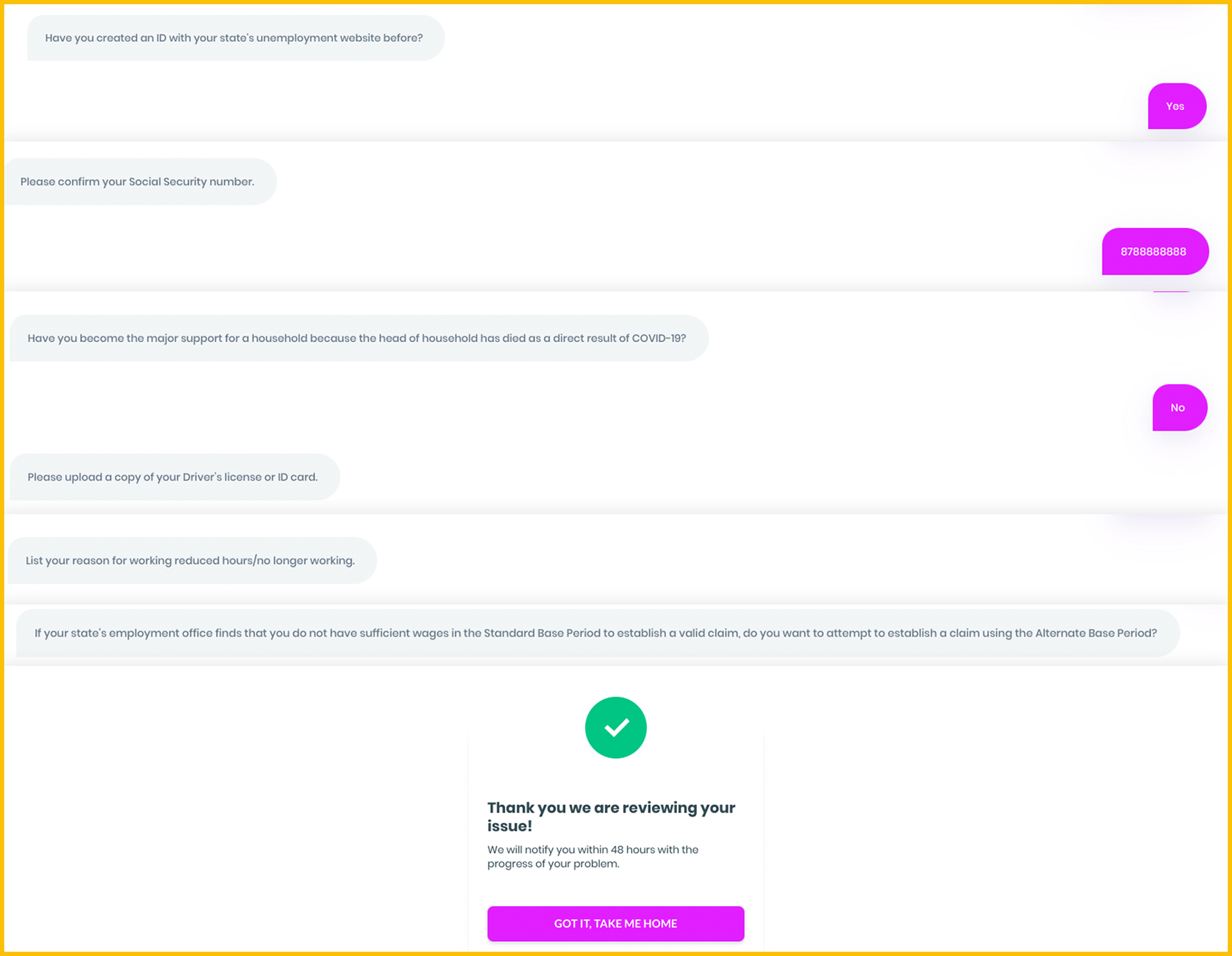
At that time there was only one platform that created a solution to this problem. DoNotPay designed a chatbot where people could answer questions and they sent the application on their behalf.
The downside of this system was that it asked roughly 10 questions whereas the actual Application had over 60. We don't know what the success rate of their chatbot was but I assume they contacted users asking for more data.
We knew we wanted to fully automate the entire process and make the application experience easier.
Official forms
Prototyping
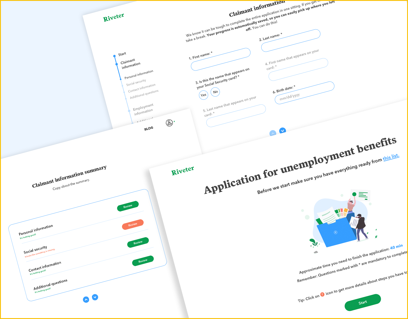
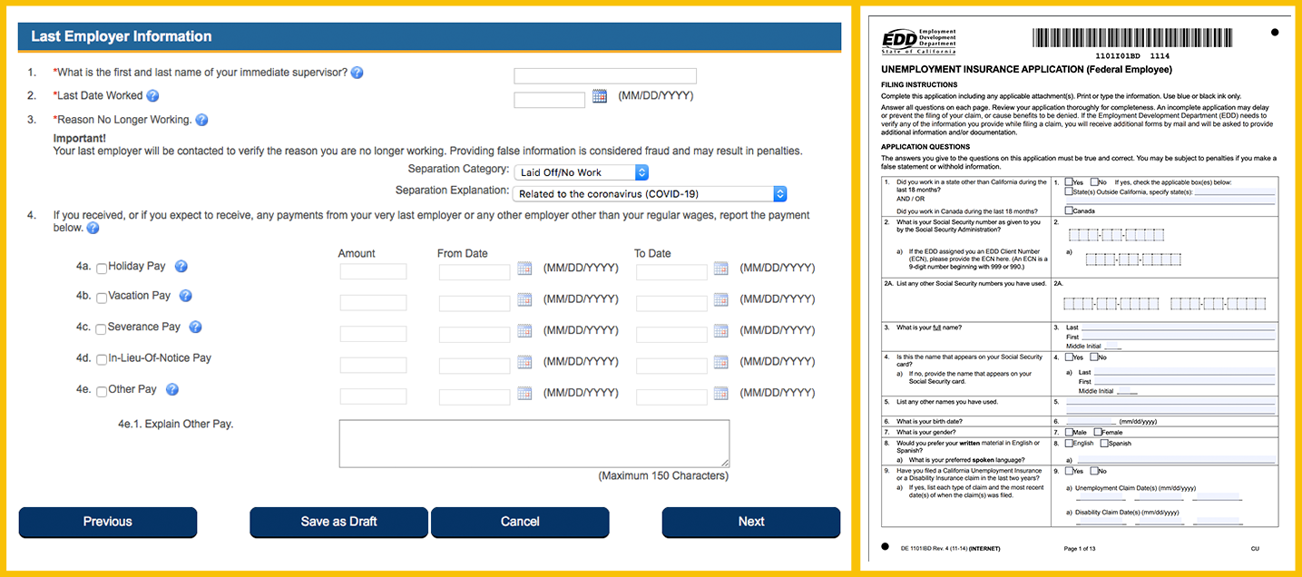
Every state has different requirements and their applications differ wildly so we decided to focus on the California.
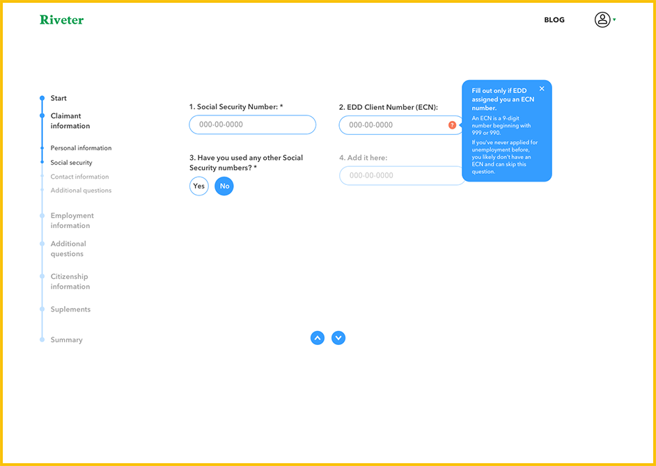
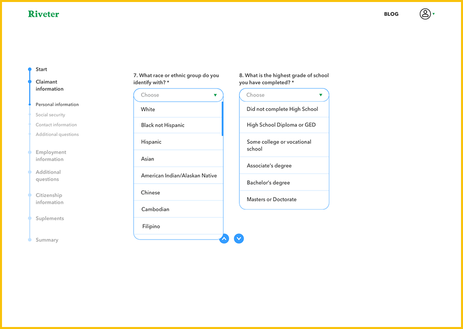
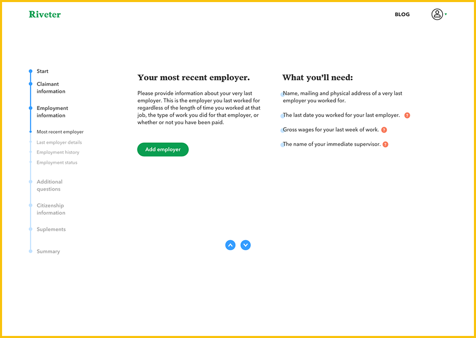
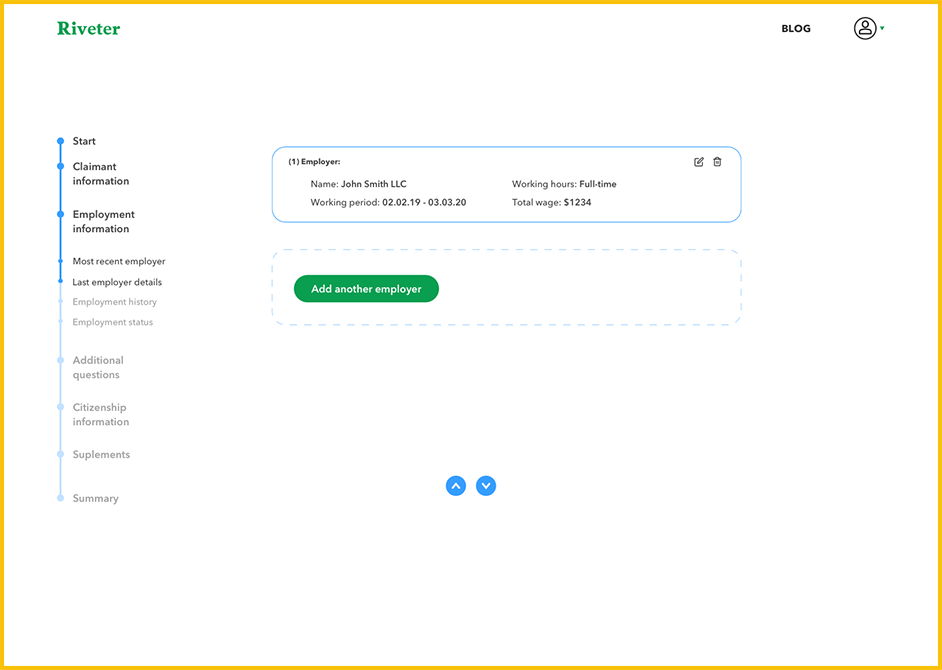
I took their official form and structured the questions from scratch and re-wrote them entirely because they were hard to understand even for the native english speakers.
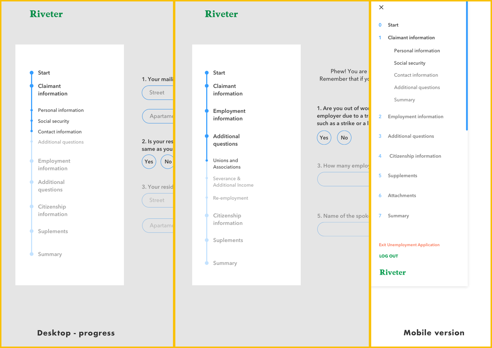
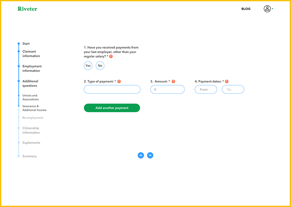
I created 5 new main categories with subcategories inside. To make it easy to navigate I designed an expandable menu which also indicated the progress of a user. Every link is clickable and it redirects the user to the desired portion of the application.
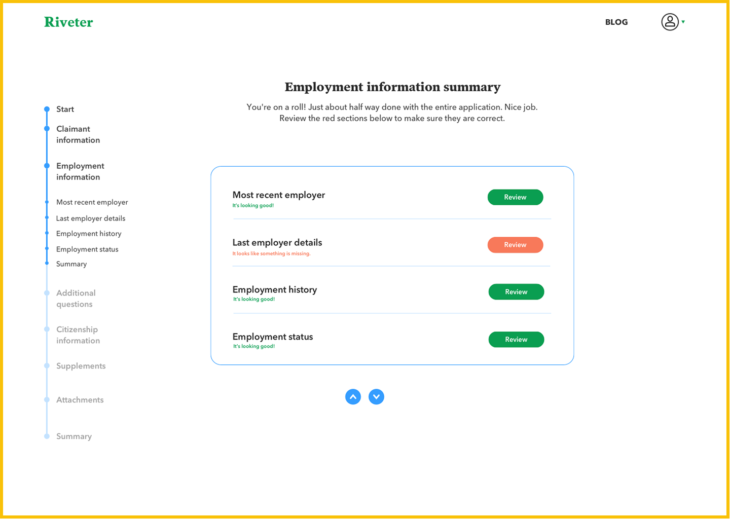
At the end of every category, we placed a Summary that showed which fields weren't completed. The button "Review" redirects the user to a missing fields within a subcategory.
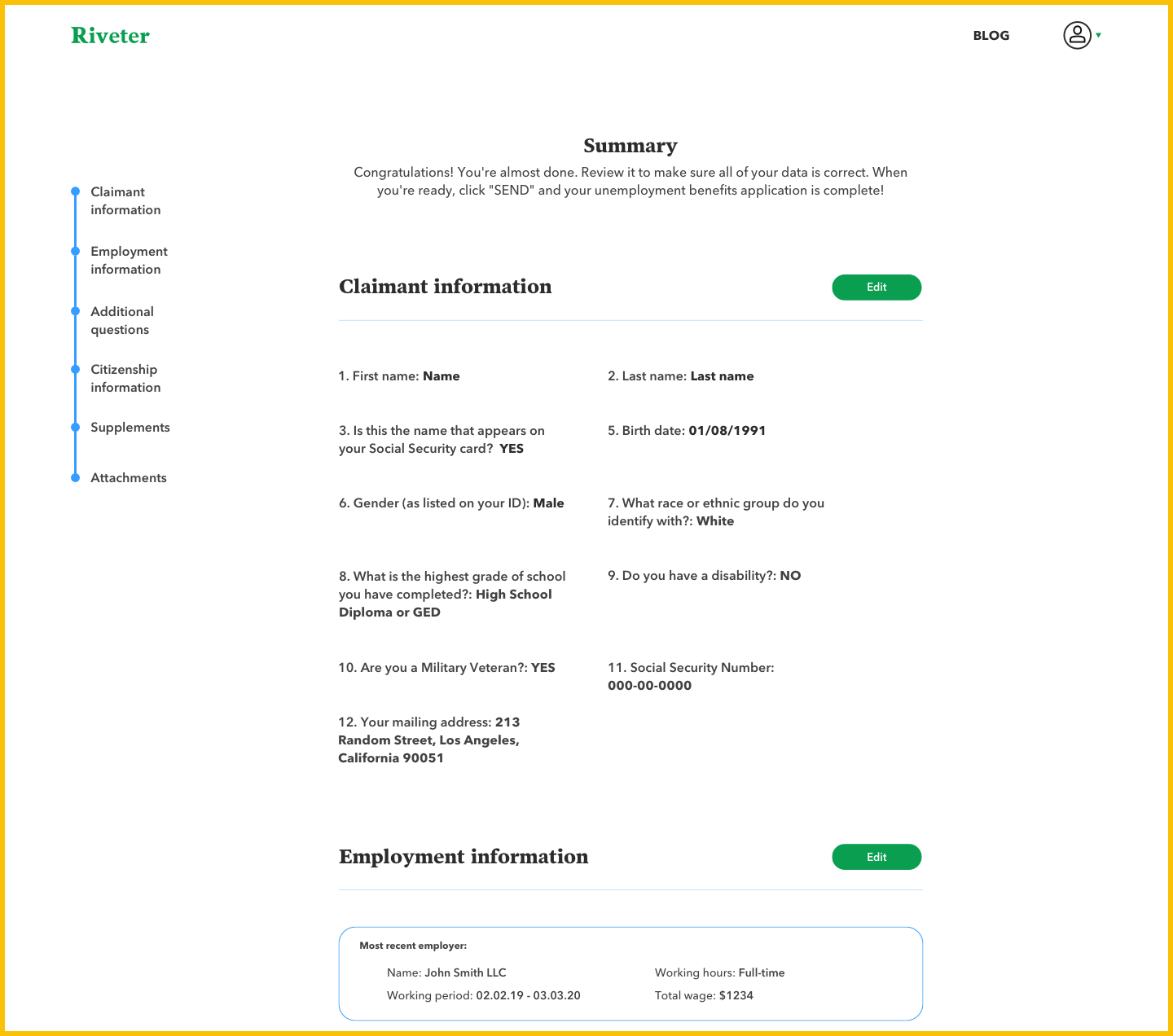
The final Summary page allows our users to go through the application one last time to double-check misspelling or other errors that we couldn't validate.
The right menu stays there for easier navigation and buttons "Edit" allow users to change their initial input.
The right menu stays there for easier navigation and buttons "Edit" allow users to change their initial input.
Usability testing
I created a prototype in inVision to test how users navigate through it. Every participant already had an experience with official gov application so they could better point out the differences and areas for the improvement.
The main insights:
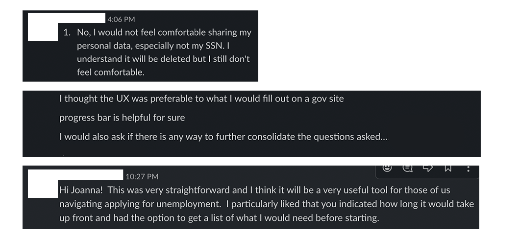
1) A few people had an issue with sharing their SSN number with non-gov platform
2) The overall feedback was very positive, especially about the navigation
3) We knew we have to work more on consolidating the questions
4) Users knew right away how to navigate through the form and how to insert their data in a different field types
Feature launch
After slight improvements we launched our feature. We decided to test it again, this time on real users. People found it easy to navigate and there were no significant usability problems.
More screens

Summary
Designing forms is never easy. It's a long and time-consuming process where a lot of things can go wrong. I decided to put a lot of emphasis on usability testing and double-checking every field. We worked on it as a team of 3 - designer, developer, and project manager. The task was difficult but we managed to significantly improve the user experience for the unemployment application. We had to launch this feature fast but it had to work perfectly.
We will continue to monitor the Hotjar recordings and analyse user feedback.
We will continue to monitor the Hotjar recordings and analyse user feedback.