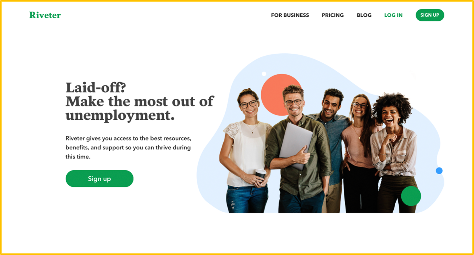
Save money, feel good, live well.
Riveter Works is a platform that provides help for those who lost their jobs due to the COVID outbreak.
We created a safe space for laid-off employees where they can find Unemployment guidance, Health Insurance tips, easy Unemployment application and negotiated discounts on various resources such as online classes, mental wellness, networking events and financial management.
About the project
COVID outbreak made over 40 million Americans lose their jobs. Riveter founders approached with a task to create a product that will serve those who need a lot of support in this hard time.
There is no such service at the American market right now. The outplacement and HR companies focus on finding new career opportunities and helping unemployed people land jobs quickly. We wanted to fill out the niche and give our users a product that will help them during this transition time.
My main challenges were:
1) Conduct User Research with qualitative and quantitative methods
2) Design MVP within 4 weeks
3) Design full-blown product based on testing and user feedback
The process
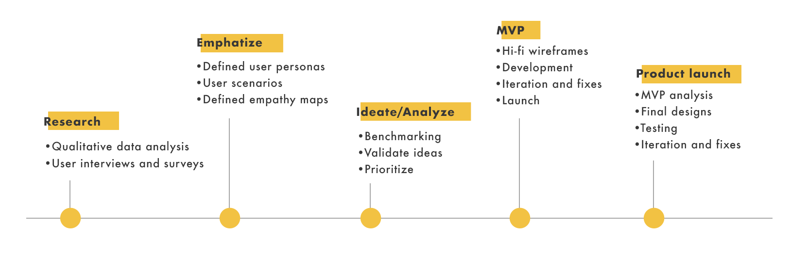
User research
Qualitative data analysis
To better understand the problems that unemployed people are facing I analysed articles, support groups, and slack channels from all over the Internet to have a better understanding of their basic needs and struggles. It was a great base to find the first users for interviews and prototype testing. The overall feedback was very positive throughout the entire research process and it helped me with forming a solid User Problem.
After MVP and final Product were released we tracked Heat maps and recordings in HotJar. It was a great source of information about user behaviour because they contrasted with the feedback we've got from our interviews. Thanks to it we knew where the fixes are needed the most.
Interviews and in-depth surveys
We conducted a series of User Interviews to better understand their problems and to be able to formulate our v1 User Persona. We interviewed around 20 people in stage 1 of our research. We wanted to go deep into their experience with unemployment.
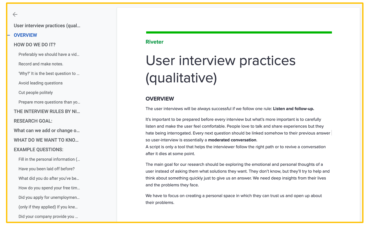
I was responsible for guiding the research phase so I created a "User Interview Practices guideline" to make sure we will gather data that is possible to analyse and compare.
On top of it, we created an in-depth survey where we asked specifically about our users' needs and their basic spending. We used this data to determine what features we should focus on while building a v1 product.
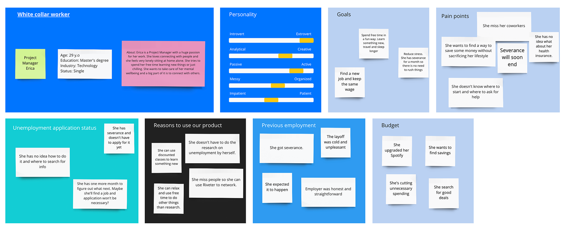
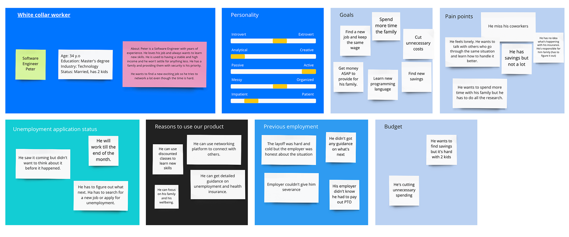
User persona
Based on our research I created two User personas that stood out the most. I used Miro for that purpose to share it with my team easily.
We focused on White-collar workers knowing that this profile can change with time. We had to remember that we conducted our interviews remotely so people who could talk to us were tech-native, active on social media, or other networking platforms. One of the goals for the future will be validating this profile and focus on its development.
We focused on White-collar workers knowing that this profile can change with time. We had to remember that we conducted our interviews remotely so people who could talk to us were tech-native, active on social media, or other networking platforms. One of the goals for the future will be validating this profile and focus on its development.
For now, we decided to stay with the assumptions we've got from our research.
The main differences between these personas are:
1) Married/single
2) Severance/no severance
3) Free time to spend with a family/free time to spend with friends
1) Married/single
2) Severance/no severance
3) Free time to spend with a family/free time to spend with friends
The main similarities:
1) They want to save money without sacrificing their current lifestyle
1) They want to save money without sacrificing their current lifestyle
2) They upgraded their entertainment subscriptions (Spotify, Netflix, HBO)
3) They are lonely. They miss their colleagues and meeting with new people
4) They don't know how to apply for unemployment and what will happen with their Health Insurance
Persona no.1
Persona no.2
Benchmarking
Users are used to specific patterns within industries so keeping the consistency is very important. Reusing common patterns is also crucial for products that are utilised daily because their use may depend on the efficiency of performing desired tasks.
To better understand common patterns for Outplacement and HR companies, I've analysed their platforms.
To better understand common patterns for Outplacement and HR companies, I've analysed their platforms.
The main take-aways are:
1) "Request Demo" CTA for a business client is crucial to selling a service
2) Subscription model increases conversion for individual client
3) Long onboarding is not a problem if it personalises the experience
4) Finding relevant resources must be performed fast
5) Client support must be easily reachable especially for a new product such as Riveter
Riveter Works offers service like no other in the US. We had to reuse known patterns and adapt them to our needs and offer.
MVP phase
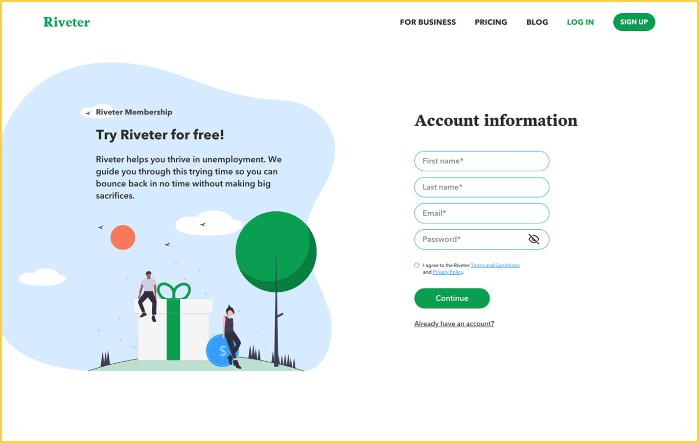
Working for a fresh startup as a Founding Designer means designing FAST. I created first wireframes based on a research and the general idea. We wanted to test if our offer is relevant to the users' needs.
First Website flow
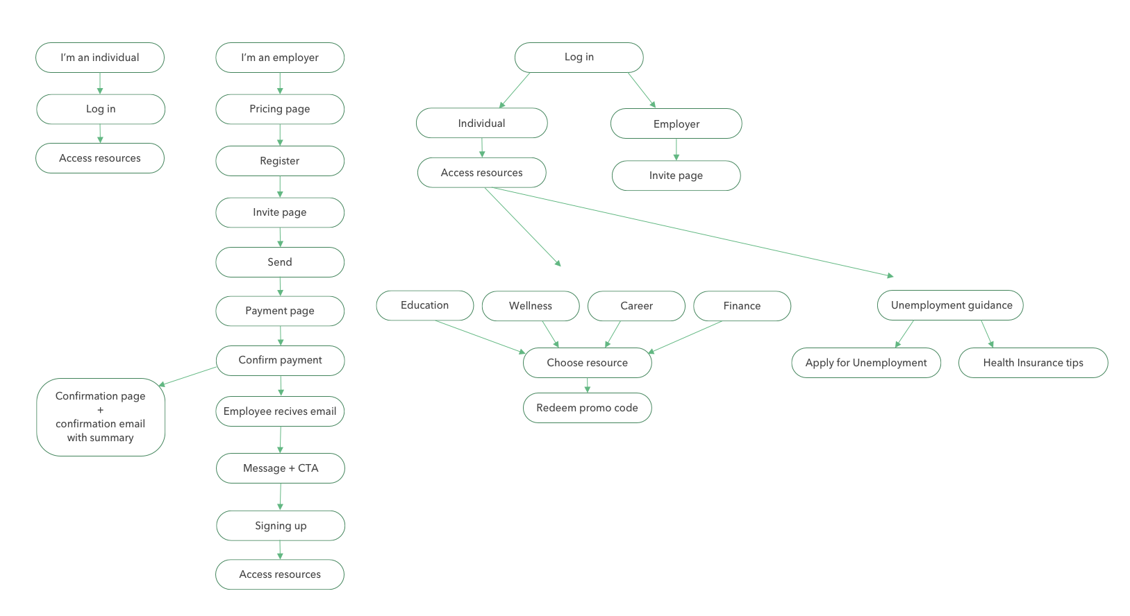
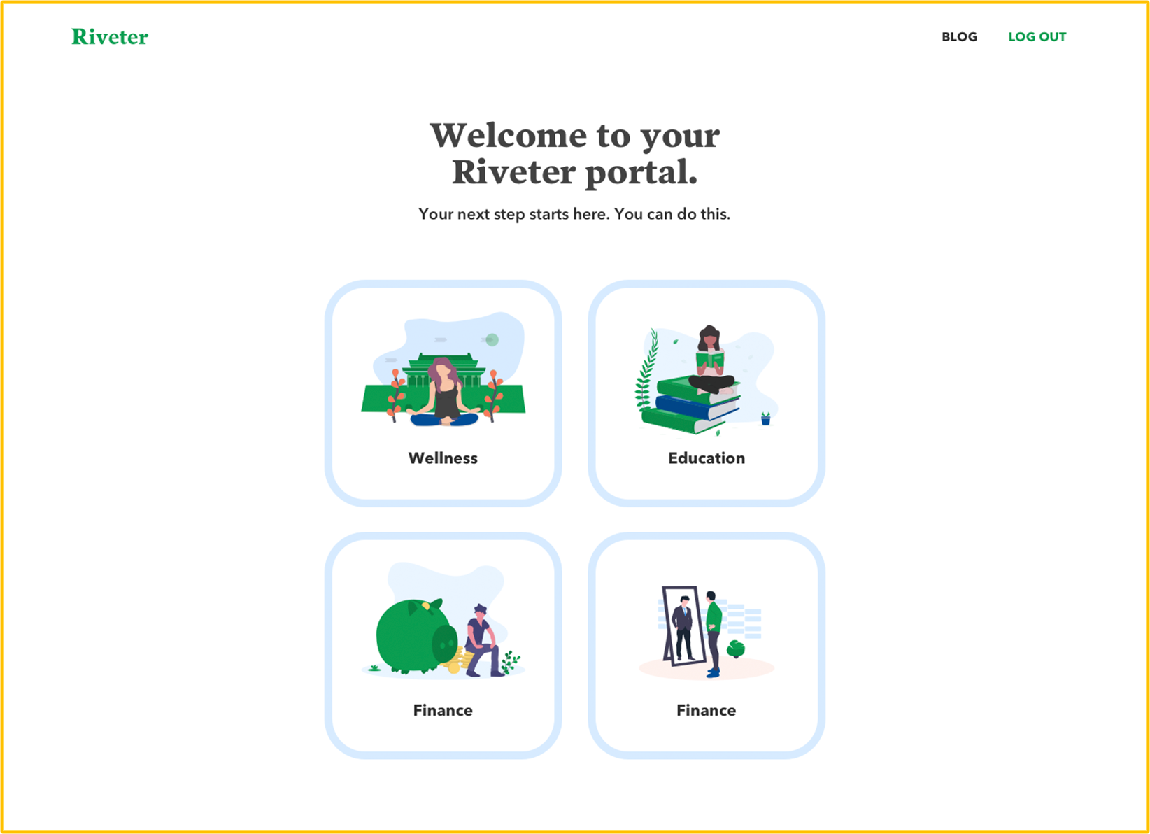
Example screens
I designed a full MVP within 4 weeks. I was responsible for creating lo-fi and hi-fi wireframes and final simplified designs.
The visual part wasn't important - we wanted to launch it fast with basic features and test it on our users.
The visual part wasn't important - we wanted to launch it fast with basic features and test it on our users.
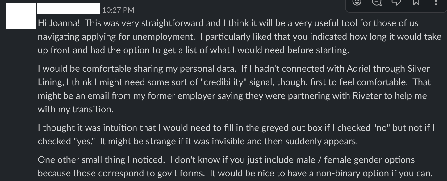
Usability testing
I conducted 5 tests on people who have never used Riveter before. Thanks to it I could discover new insights from people who were using such a product for the first time. Riveter is something completely new on the market and we had to discover how the learning curve and discovery phase looks like for our users.
The main usability insights discovered through testing:
1) Resource page was a long wall of offers and our users didn't know why we redirect them outside our platform.
2) They didn't understand what we actually offer. They didn't know if we negotiated the price, what was our goal, and what value they were getting.
3) Lack of filtering bothered them even though there were only a few offers
4) The pricing model wasn't clear enough
Most of these problems we predicted beforehand but it was a good base to plan the product roadmap.
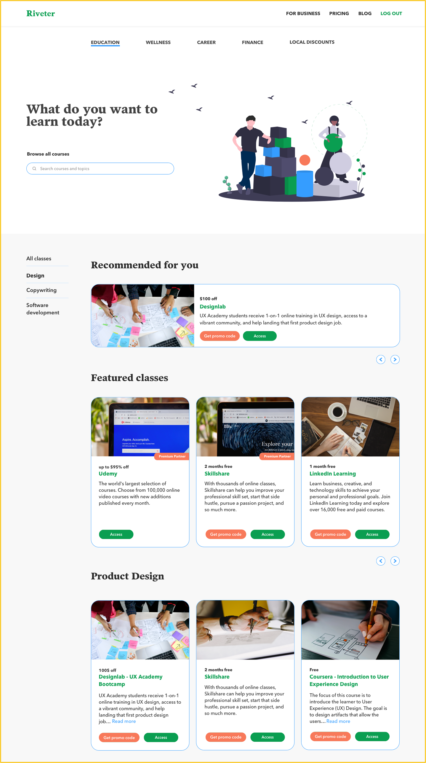
Product launch v1
We decided to focus on an individual client and block out the business client flow with "Request demo" CTA.
The main changes:
1) We prioritised Education and Wellness resources over Career and Finance based on our user research
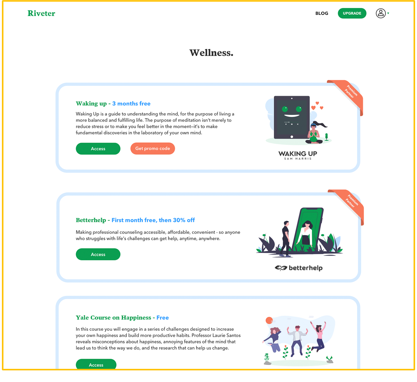
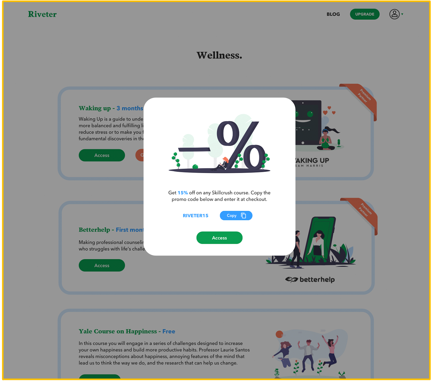
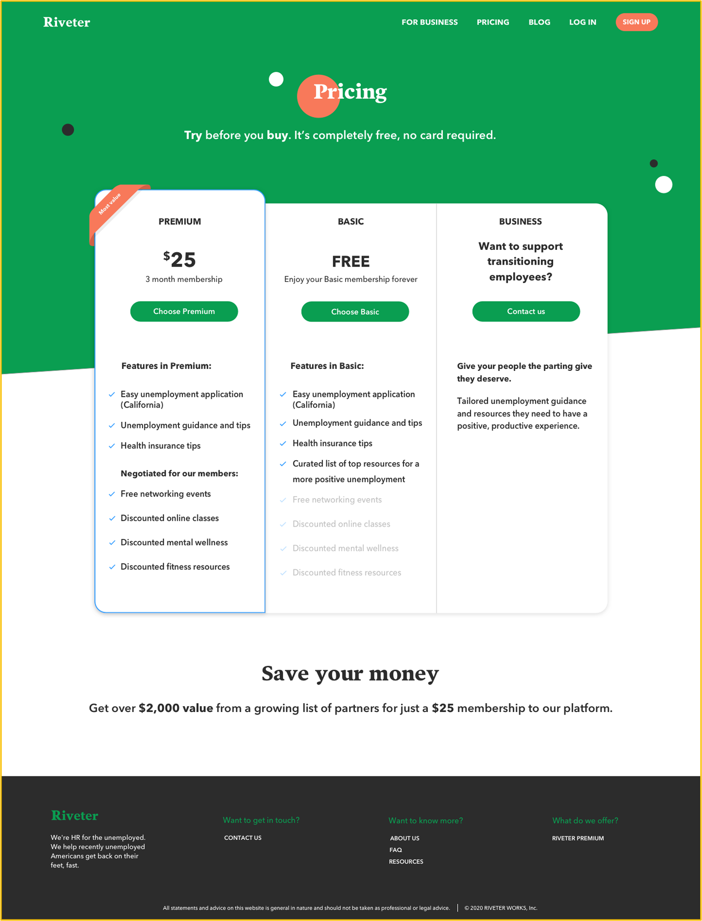
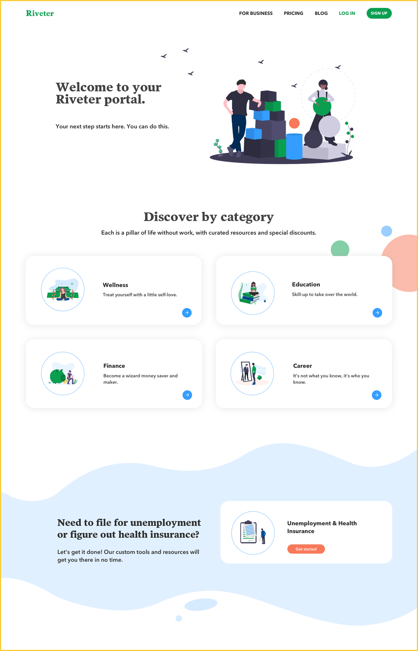
2) We stayed with a subscription model and added a new "Basic membership" tier which allows our users to check out the platform for free. The "Premium member" gets full access to all resources and the Basic member gets access to Unemployment guidance and free resources.
3) We partnered with Outplacement companies to get more traffic
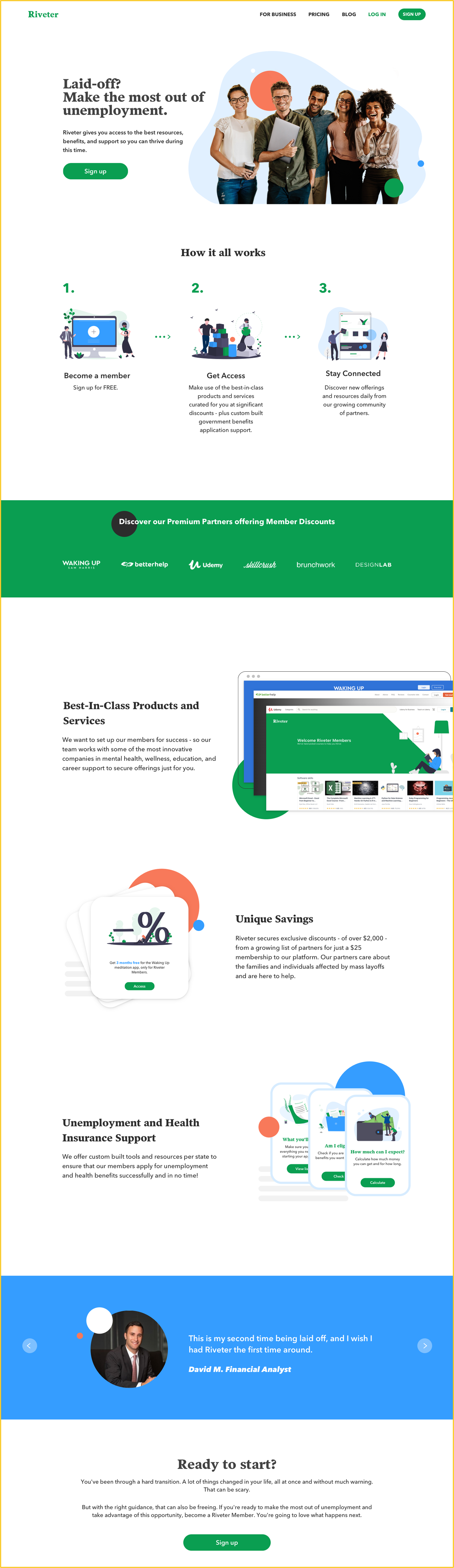
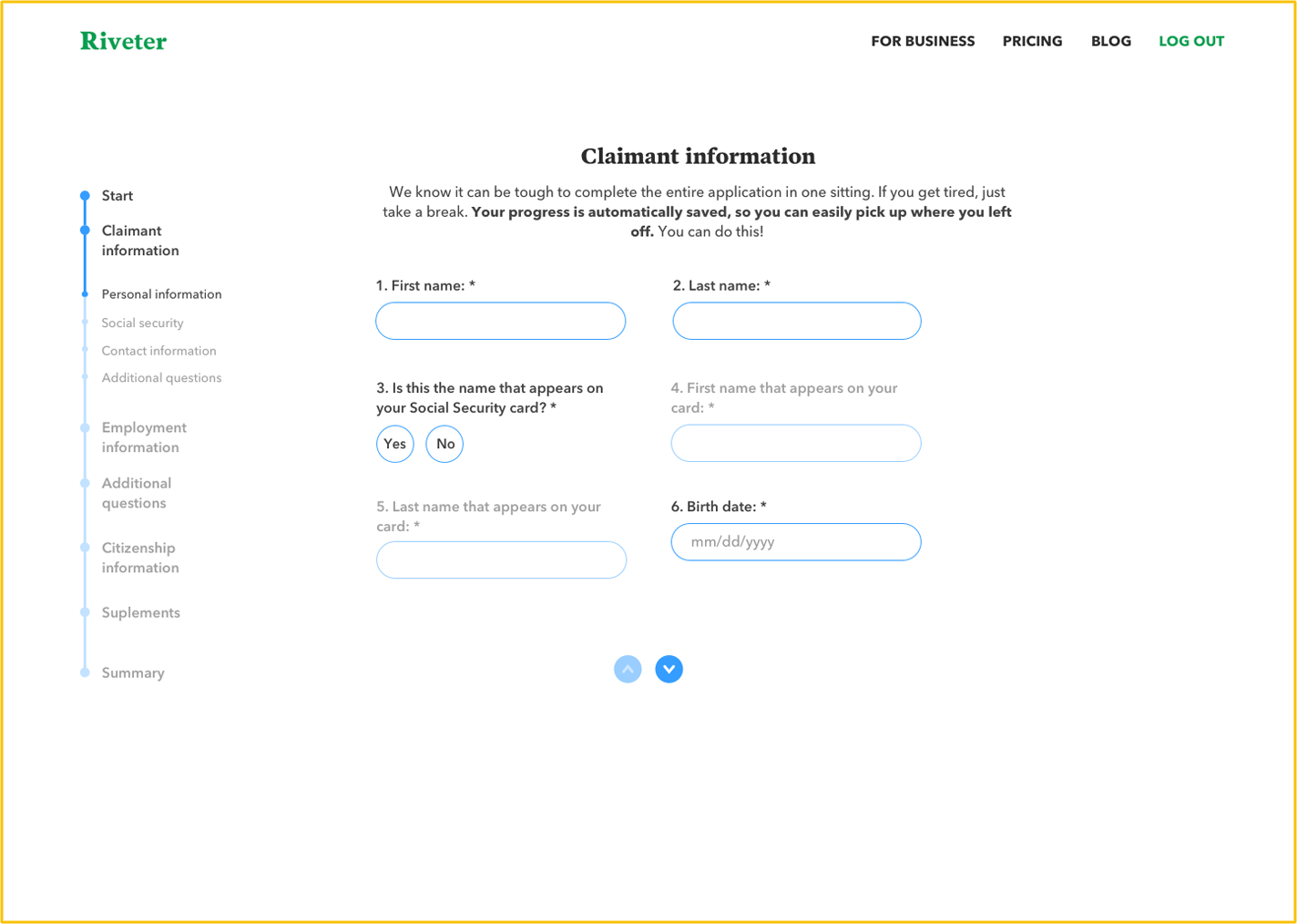
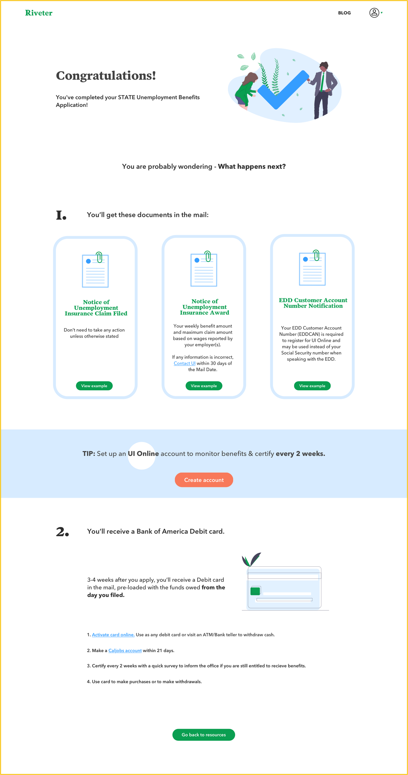
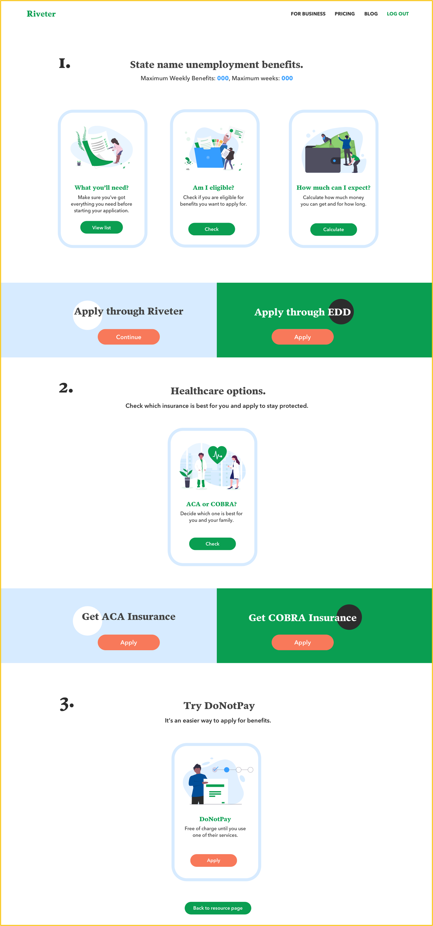
4) We've created an Unemployment Application for California. Every user from California can apply for benefits through our platform. It was nearly impossible for them to use a complicated government website that crashed every few minutes. We wanted to make the entire process easier and user friendly. More about it here.
5) We started the blog in which we explain the details about unemployment, where to search for help, and how to navigate the first days of unemployment.
2) We stayed with a subscription model and added a new "Basic membership" tier which allows our users to check out the platform for free. The "Premium member" gets full access to all resources and the Basic member gets access to Unemployment guidance and free resources.
3) We partnered with Outplacement companies to get more traffic
4) We've created an Unemployment Application for California. Every user from California can apply for benefits through our platform. It was nearly impossible for them to use a complicated government website that crashed every few minutes. We wanted to make the entire process easier and user friendly. More about it here.
5) We started the blog in which we explain the details about unemployment, where to search for help, and how to navigate the first days of unemployment.
Example screens
Summary
After all the user research and releasing the MVP we had a lot of time and data to learn more about our users. We knew in which direction we want to push the product development and we gave ourselves time and resources to experiment and test every possibility. In this case study, I described very generally how the process looked like but in reality, it was much more complex. We were developing it rapidly - we wanted to stay flexible with our ideas and respond to our users' needs.
3 months after we started our product journey we've come to the stable growth of 10% new users per week. It's just a starting point because the platform needs more resources, better onboarding experience, and a better understanding of user behaviours to build a full-blown product.