About the client
Committee of the Council of Ministers for the Digitization is a subsidiary body of the Council of Ministers and the Prime Minister.
The main tasks of the new ministry are to develop broadband infrastructure, support the creation of web content and e-services and promote digital competences among citizens.
Their understanding of effective digitization is based on three pillars: providing internet access, developing web content and services and promoting digital competences.
Process
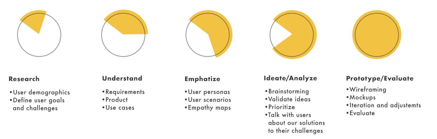
Problem
The dane.gov.pl website needed a thorough redesign in terms of the accessibility and usability, based on the WCAG 2.0 guidelines.
We wanted to improve general UX of the site for all users as well as design graphic and tabular content adapted for the blind and visually impaired.
This group of users uses screen readers, keyboard shortcuts and a list of links during everyday internet use, and thus, they often do not have access to the content that can not be read automatically like images, films or animations.
Solution
During the design process, we focused on making content on the website readable by all screen readers used by our users and we proposed a more intuitive layout of the website thanks to which it was fast and easy to move around with keyboard shortcuts. We improved general UX of the site and fixed small bugs. It was more clear navigational-and informational-wise.
Disclaimer
(personal blabbing)
Accessibility design can be considerably easy and inexpensive to implement. It's actually a wonderful way to design a site with great UX not only for users with diverse abilities but also for general public. As designers, we have the responsibility to make sure we create human-friendly products - clear and easy to navigate for everyone. Approximately 15% of the world population lives with some form of disability (WHO, 2011), which is more than 1 billion people! We can design a space where everyone is able to use our product without any boundaries or limitations. With this project, we did what we could in a given time and budget but more solutions are available in terms of improving accessibility and user experience for all.
General Target Audience
- Ages: 20-80 years;
- Citizens interested in state activities;
- Companies that build innovative products and data based services;
- Non-governmental organizations that use data in their daily work;
- Scientists conducting research;
- Officials preparing reports and analyzes;
- Citizens interested in state activities;
- Companies that build innovative products and data based services;
- Non-governmental organizations that use data in their daily work;
- Scientists conducting research;
- Officials preparing reports and analyzes;
Our Target Audience
- Before- mentioned
- People with sight impairments
- Elderly with sight and motion impairments
Goal
The aim of these actions was to design the website that will become more inclusive and valuable source of information for all users. The Ministry expected a coherent and feasible concept that took into account already existing technical facilities and will be easy to implement in the future.
Analysis summary
The dane.gov.pl website at a glance contains all the necessary facilities for people with visual impairments in the top page navigation. It was also kind of adapted for screen readers and keyboard shortcuts users. The problem, however, was the overall bad UX design. Moving around interface was difficult for all users - even without disabilities.
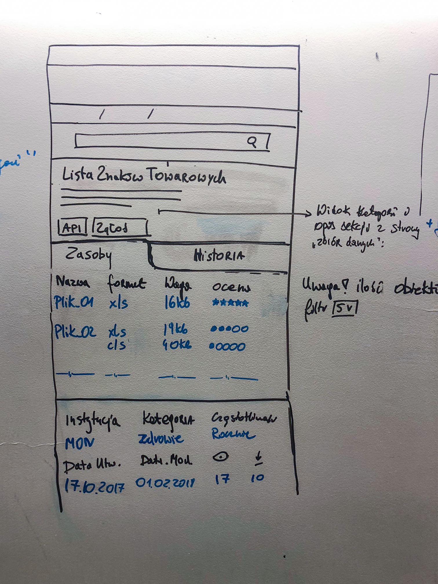
The site doesn't have basic information in breadcrumbs, it doesn't allow downloading all files from the category - the user has to download them one by one, it does not contain file names in the preview. To get detailed information about the file, the user has to click the drop-down menu on the left, which contains non-intuitive static icons.
The site also contains non-functioning links and their titles are not information in itself. Blind users who are often using the list of links are encountering not working links and the "Read more" information from the screen reader which don's give any hint about the source article. The site also does not contain any visual view of the data.
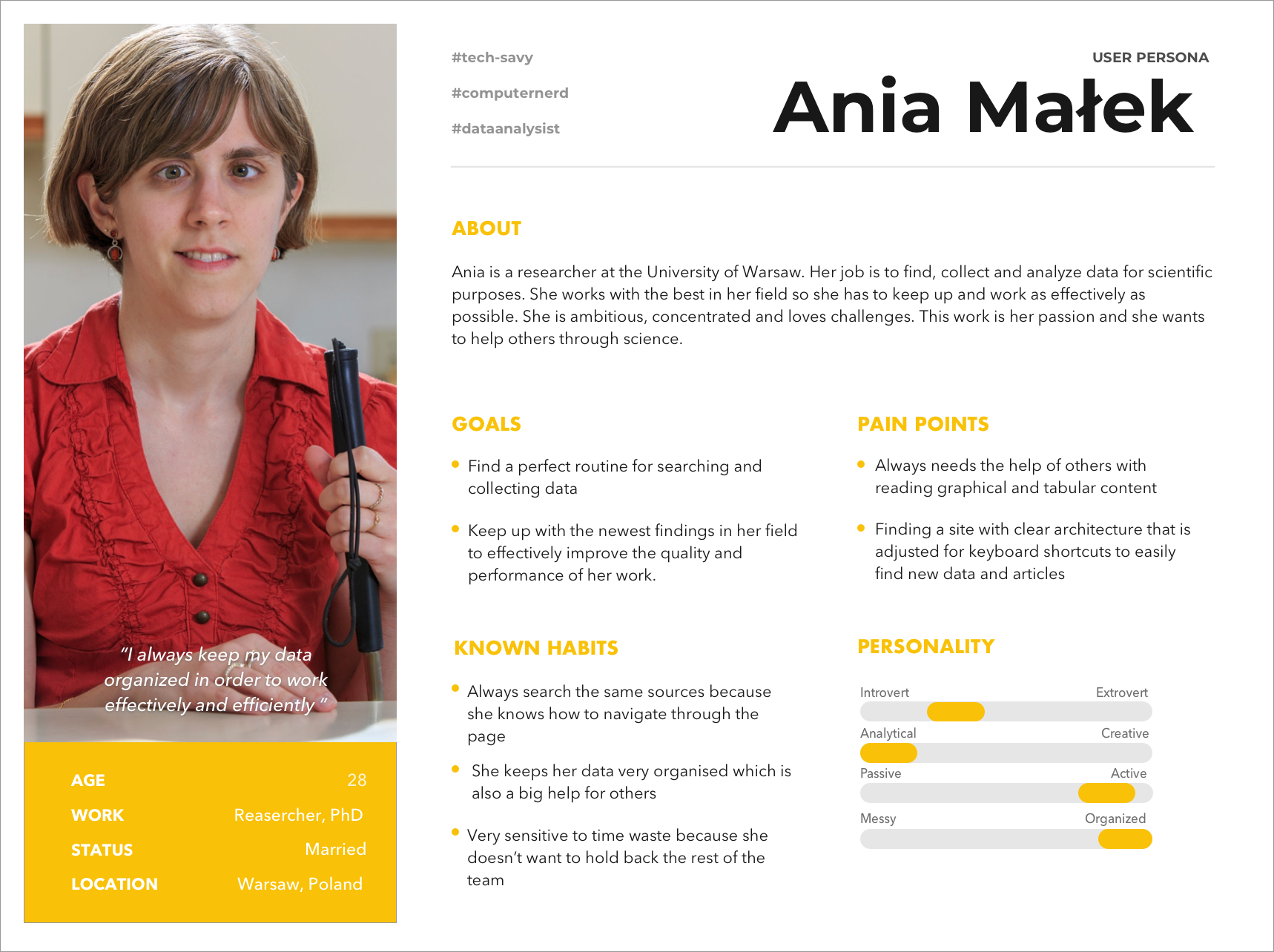
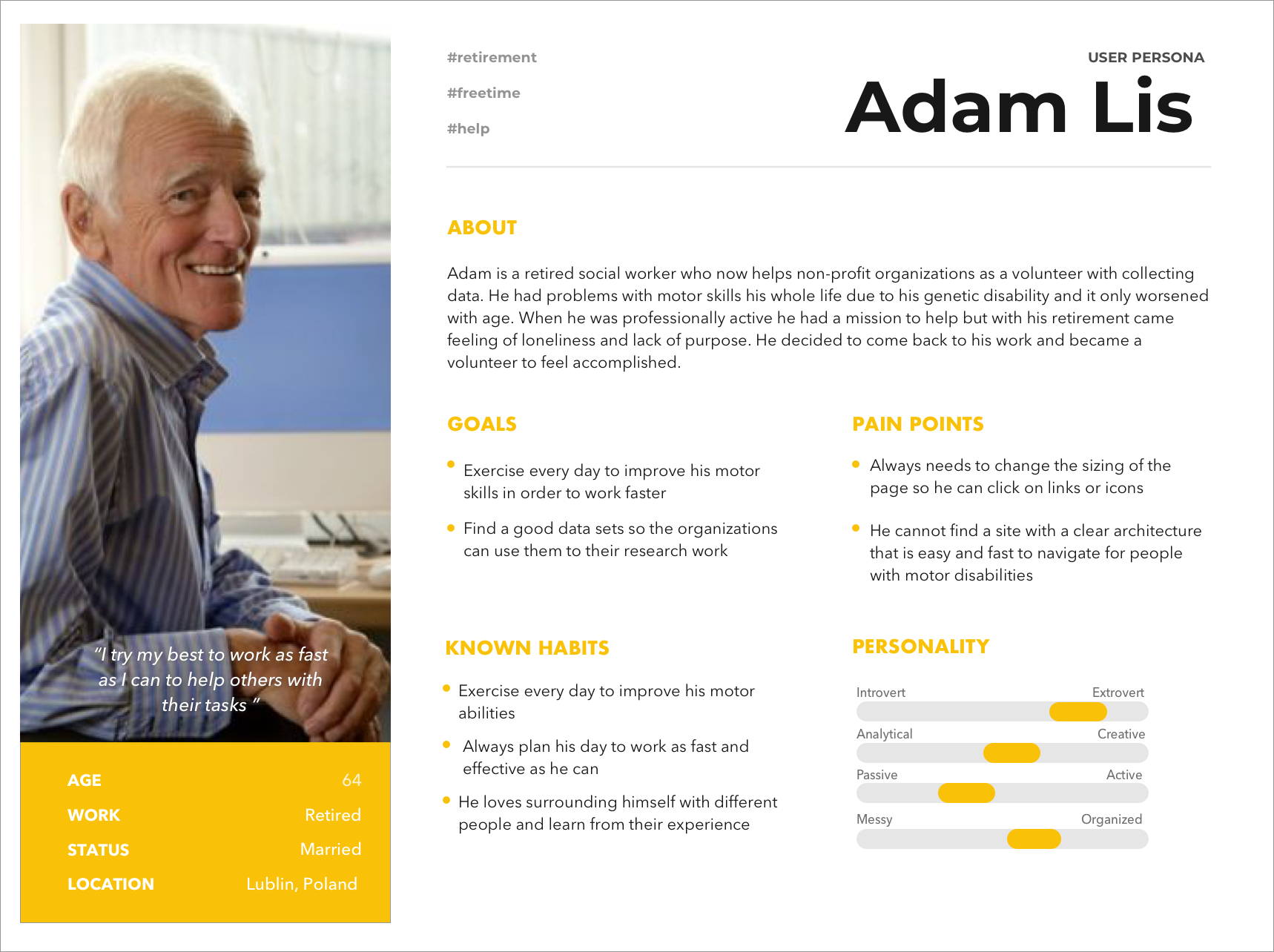
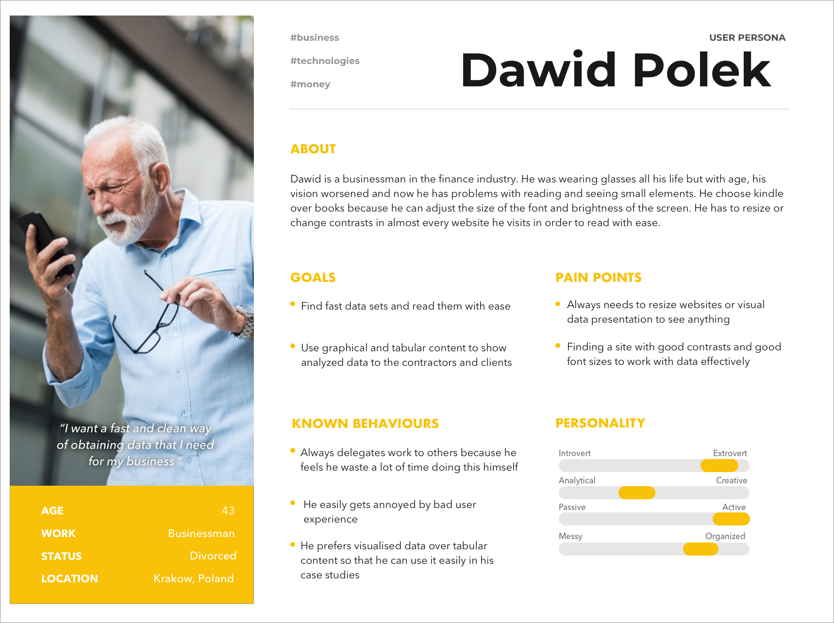
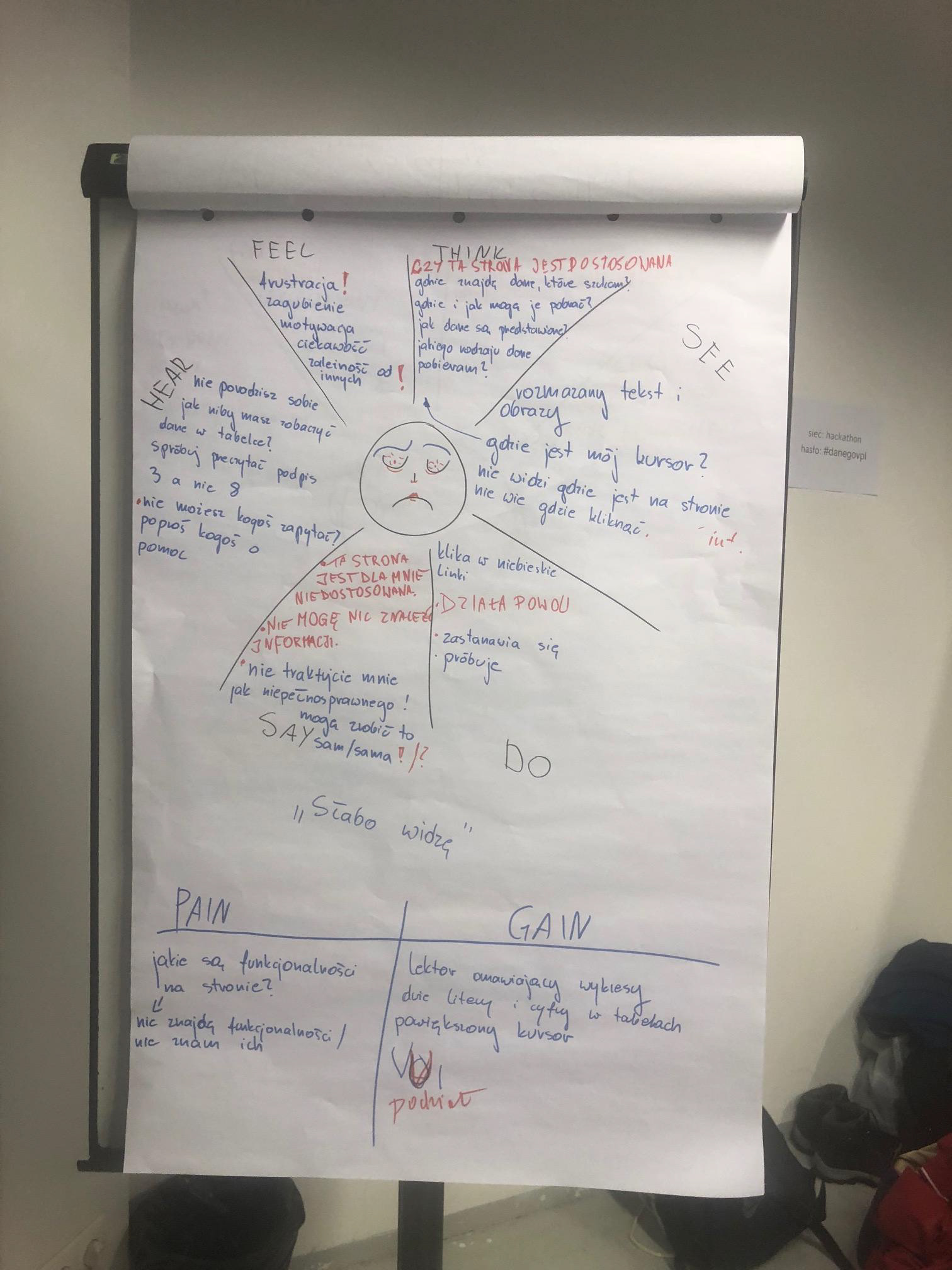
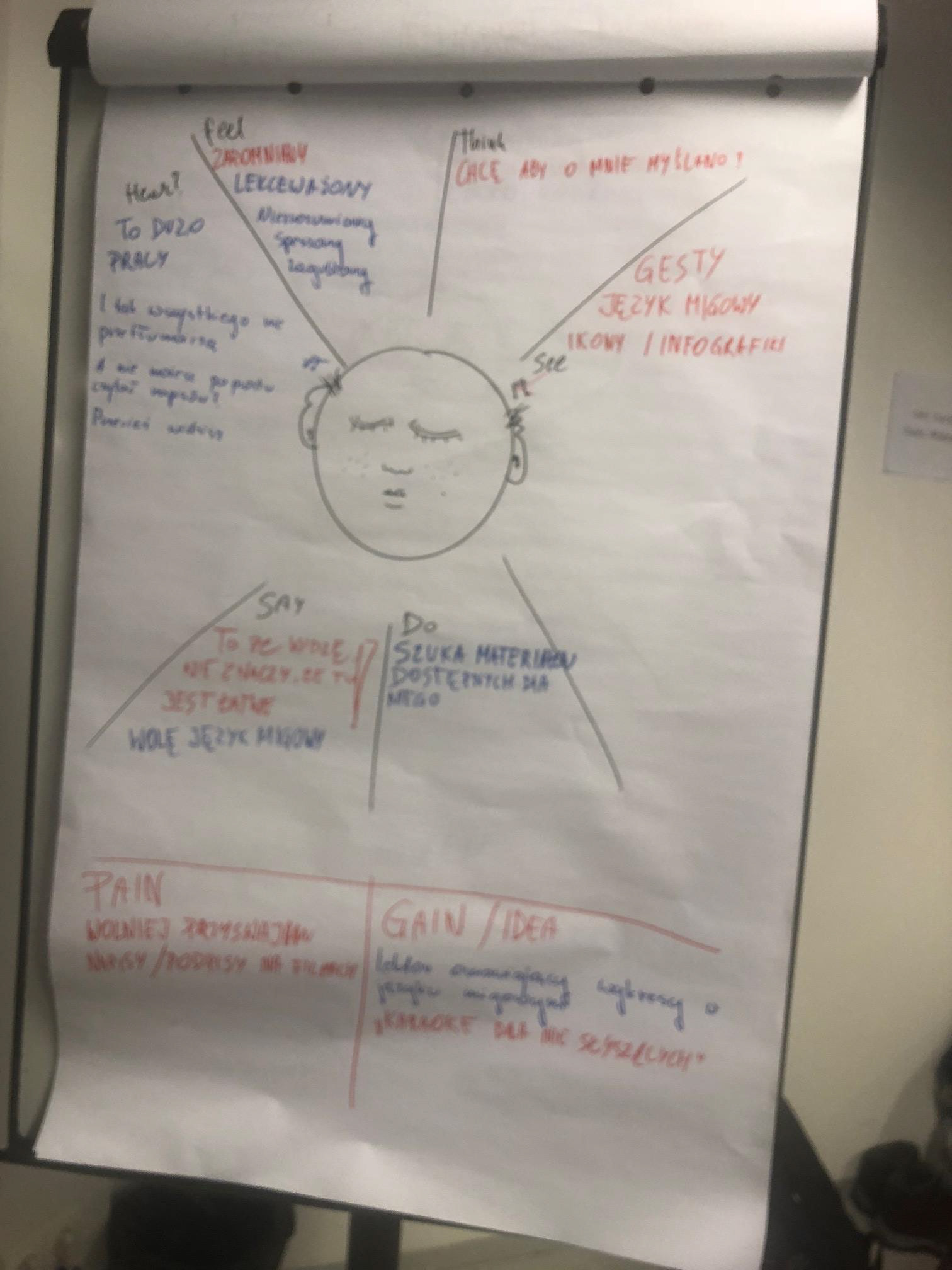
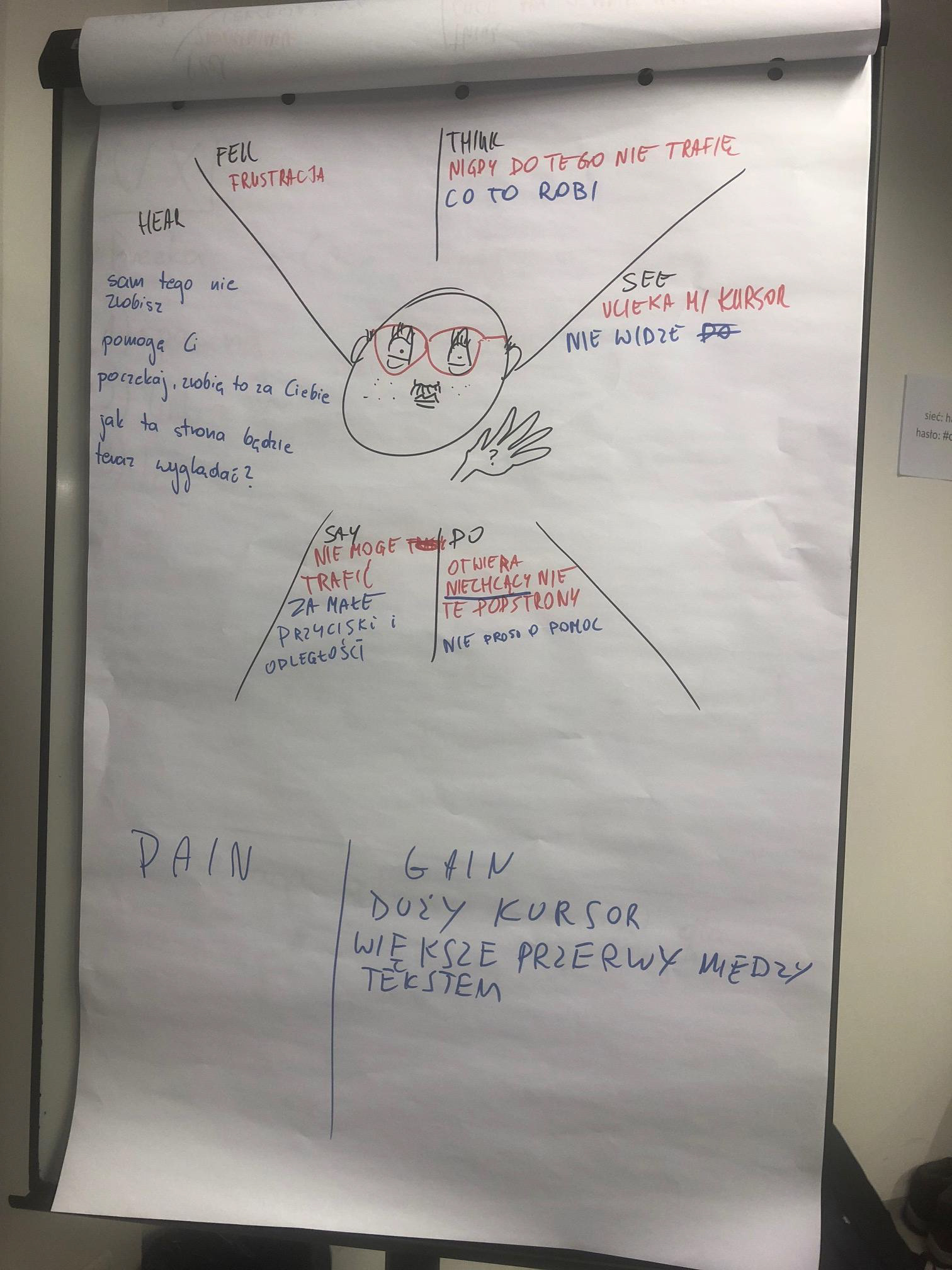
Personas & Empathy maps
Due to the time constraint, we developed 3 empathy maps for different user personas with specific disabilities. It was blind Ania, partially-sighted Dawid and nervous Adam. In our project, we focused on people with visual problems and added facilities for ones with motor disabilities.
We interviewed a few people to understand who is our user and what problems he/she is facing.
Sketches of empathy maps
We used the browser plug-in "Funkyfi". This simulator show problems that people with different disabilities are facing in their daily web browsing.
To complete our information we needed real users, so we showed a website to various social media groups for the blind and visually impaired. Thanks to its members, we have learned about problems the simulator couldn't show us. Contrasts and the lack of adaptation of the page to the screen readers were probably the most common remarks.
To complete our information we needed real users, so we showed a website to various social media groups for the blind and visually impaired. Thanks to its members, we have learned about problems the simulator couldn't show us. Contrasts and the lack of adaptation of the page to the screen readers were probably the most common remarks.
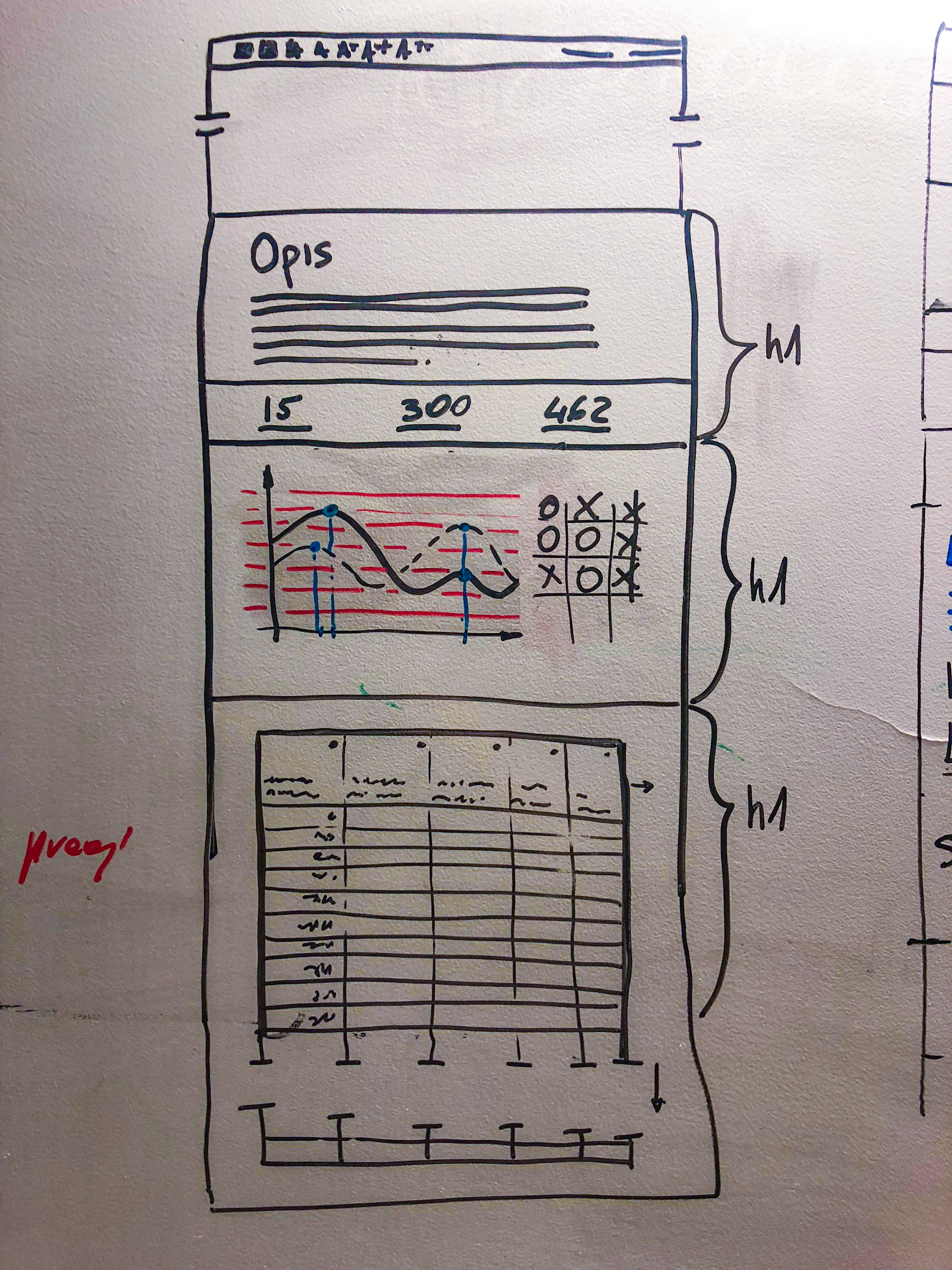
First step
We thought about better adaptation of the page to the screen readers so it was necessary to introduce the division of content into headings (<h1> to <h6>), so that the user could smoothly pass through subsequent segments by its theme, and not after each word separately as before.
Thinking about people with motor problems, it was necessary to add the space to the top navigation elements so that they are easily clickable for the user who can't precisely point the cursor. With the help of Funkify we have determined that even with slight hand shaking, the user can't easily click on any of the navigation icons. Thanks to our research we found that it was also very hard for those who are temporarily injured - with broken arm or sprained wrist.
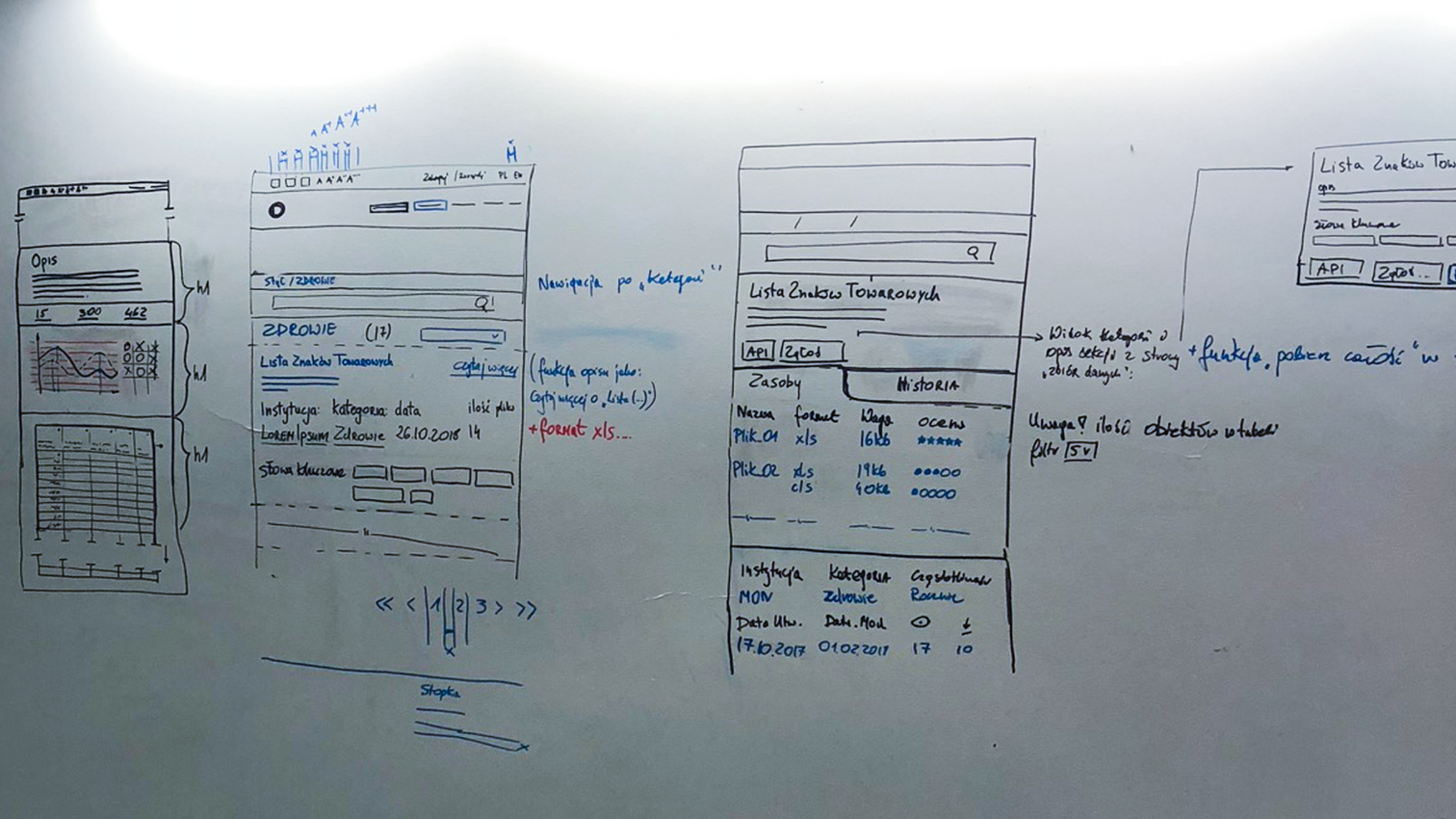
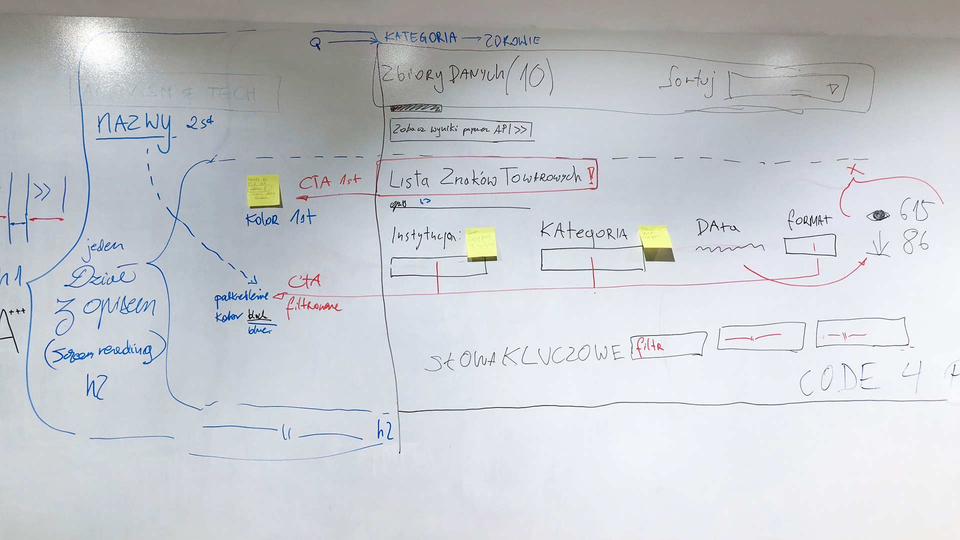
Next step
We designed an improved version of the website, basing our choices on previous research and general usability.
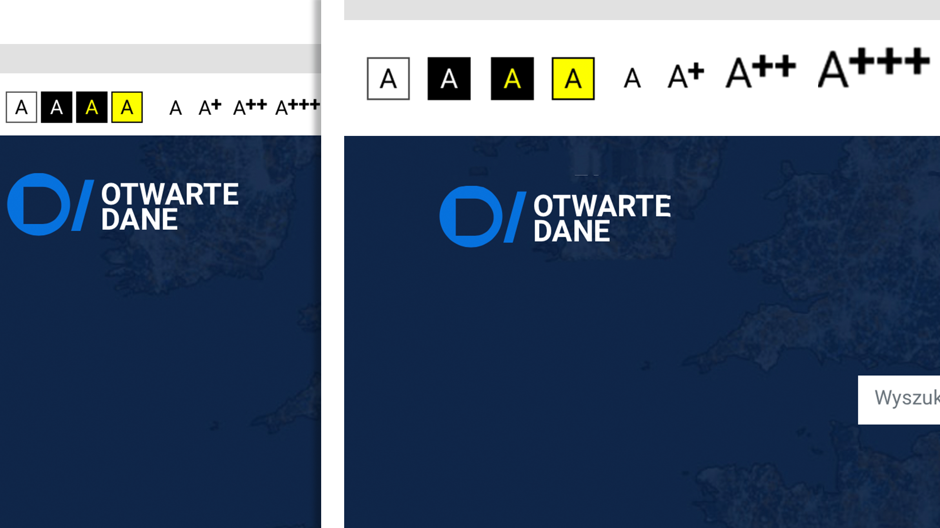
(1) The spacing between elements in the navigation was increased as well as its size;
(2) We changed the contrasts for people who don't need to use custom plugins to read, but still have some problems with vision;
(3) The content was sorted into headings for screen readers;
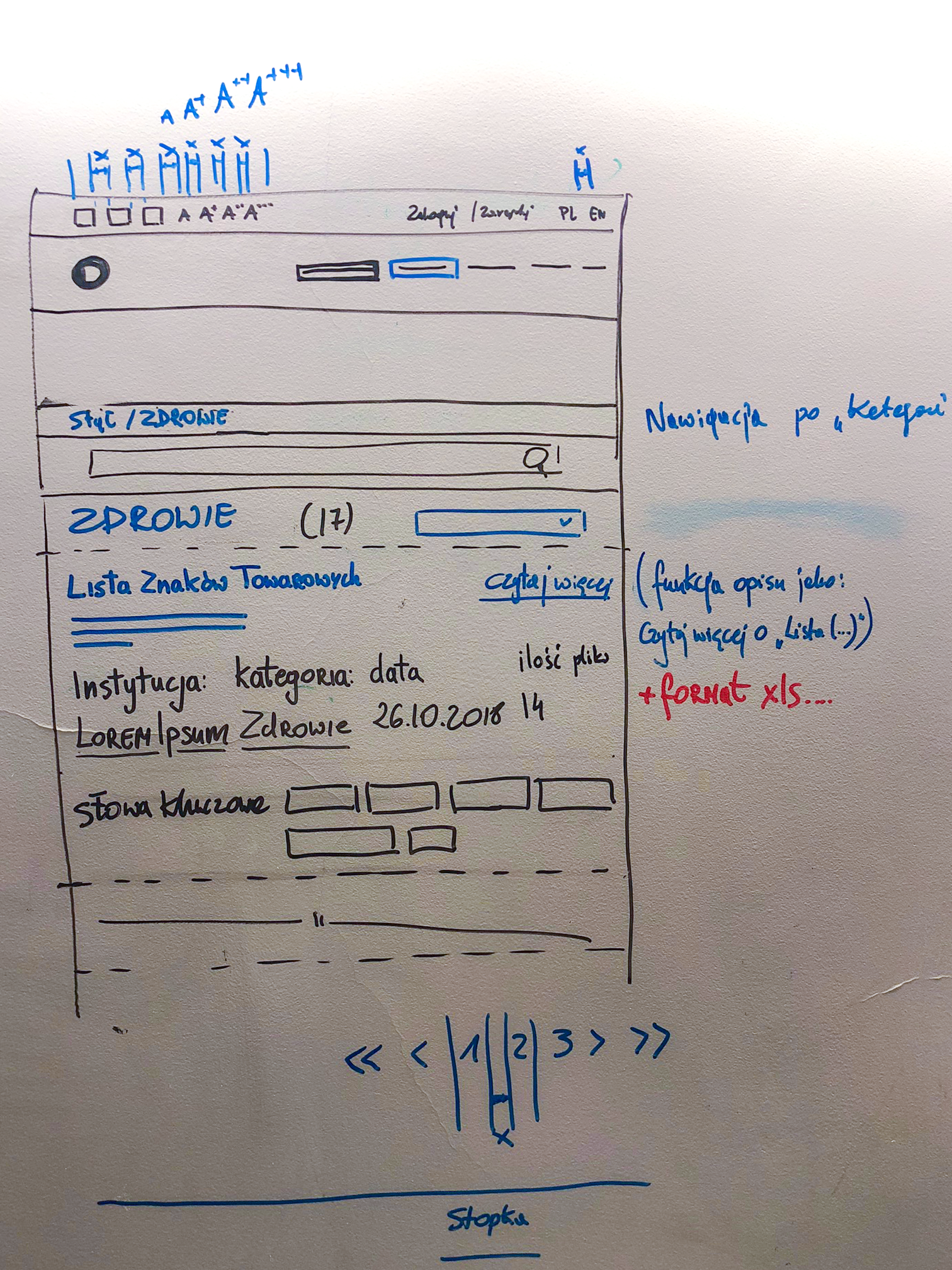
(4) The naming of links was changed for people who use the list of links to navigate through the site. Instead of "read more" the user will know what exactly what a given link means.
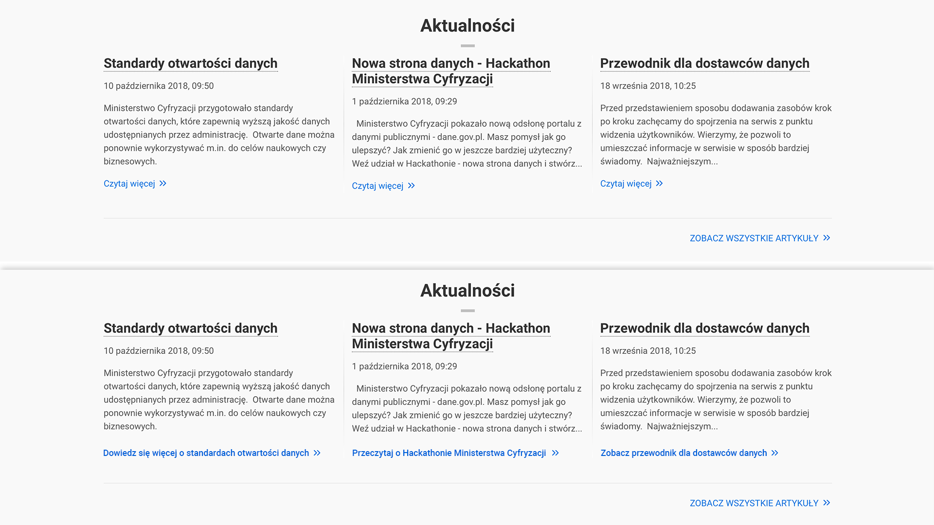
*In Polish "Czytaj wiecej" means "Read more" which doesn't say anything to someone who is scrolling through the list of links. Instead, they will see "Know more about the standard of open-data" or "Read about Hackathon organised by Ministry of Digital Affairs".
Data visualisation
We had to come up with the new form of presenting the data. It was an extremely difficult task due to the fact that the Ministry still didn't develop technology to organize hundreds of thousands of files. The data is provided by various state offices and institutions that don't segregate them and send very raw tables that contain empty lines, columns and wrong numerical data. What's more, some of the tables do not contain any data, and they create even more chaos on the site.
Finding a way to present such data in a visual form is pointless and it solves only a part of the problem. The Ministry is working on improving the process of obtaining formatted data and on segregating existing ones. In this case, we had to find the best tables on the website, that didn't have empty columns and in which analysis could be automated.
Research
We were thinking about using different charts and plots, but before we could decide on anything we had to solve our biggest issue - screen readers. They don't read images.
We were thinking about using different charts and plots, but before we could decide on anything we had to solve our biggest issue - screen readers. They don't read images.
We started to digging in and we found out that there are few useful and considerably worth trying solutions on the market.
Ministry also wanted to implement an animated charts but we convinced them to give up on this idea, having in mind people with autism or epilepsy. It is crucial to avoid blinking and moving elements with high contrast as it could be a trigger for epilepsy attack.
Highcharts
After careful competitive analysis, we decided that the best option was to use Highcharts mainly because of its low to no-cost and huge varieties of charts.
It's an SVG-based charting platform that is interactive, mobile and web-optimised and it's still actively developing. It features robust documentation, responsiveness as well as accessibility support. It offers free non-commercial license and what's more important - they support screen readers. Their solutions are adjusted for visually impaired users, and users with keyboard navigation only. They include basic signification API which allows users to hear the numerical data from the chart. We decided to give it a try and proceed with the designing process.
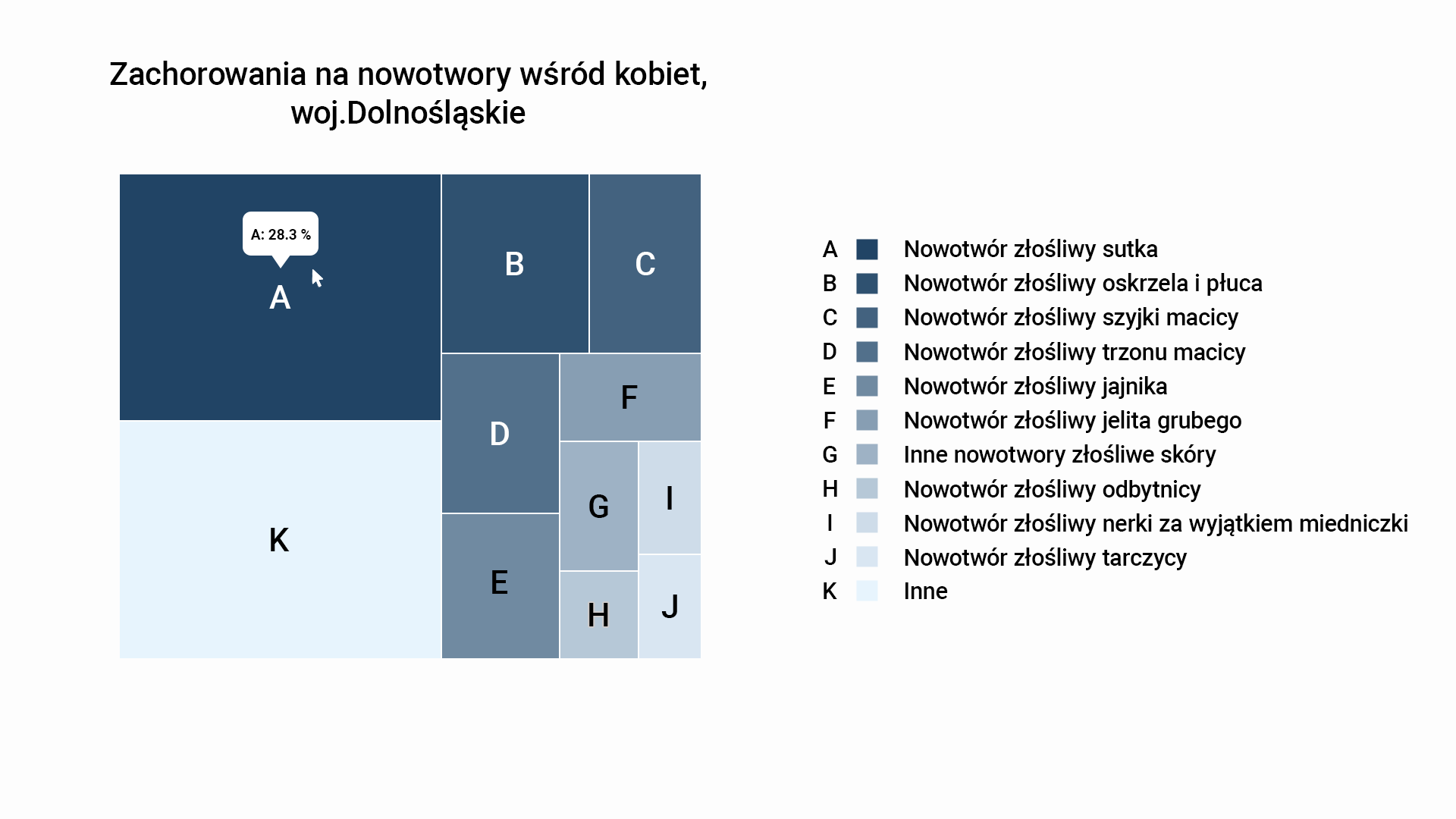
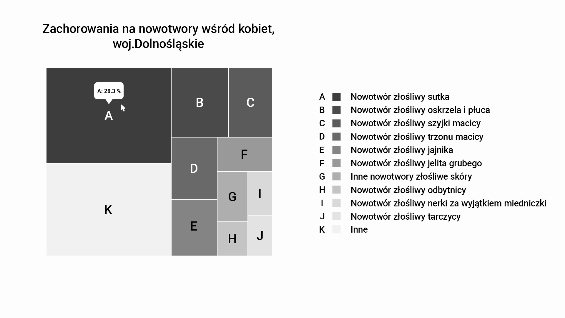
We choose treemap because a user can easily see proportions between different areas, it can contain a lot of data and still be readable. Of course, it's not the perfect solution - The downside to a treemap is that it doesn't show the hierarchal levels as clearly as other charts that visualise hierarchal data but it was enough to cover data sets given by the Ministry.
I created one chart in two monochromatic versions. The first one contained colour and the second one was in greyscale. We needed two options to:
1) check if contrasts between grey fields was good
2) some colour blind people cannot see blue, so we had to make sure it's clear and readable in grey.
We choose blue because it's the main colour of the website and we didn't want our graphics to stand out with contrasts colours. It was also the cleanest looking solution.
We wanted to make sure, everything was clear and easy to read.
Final UX improvements
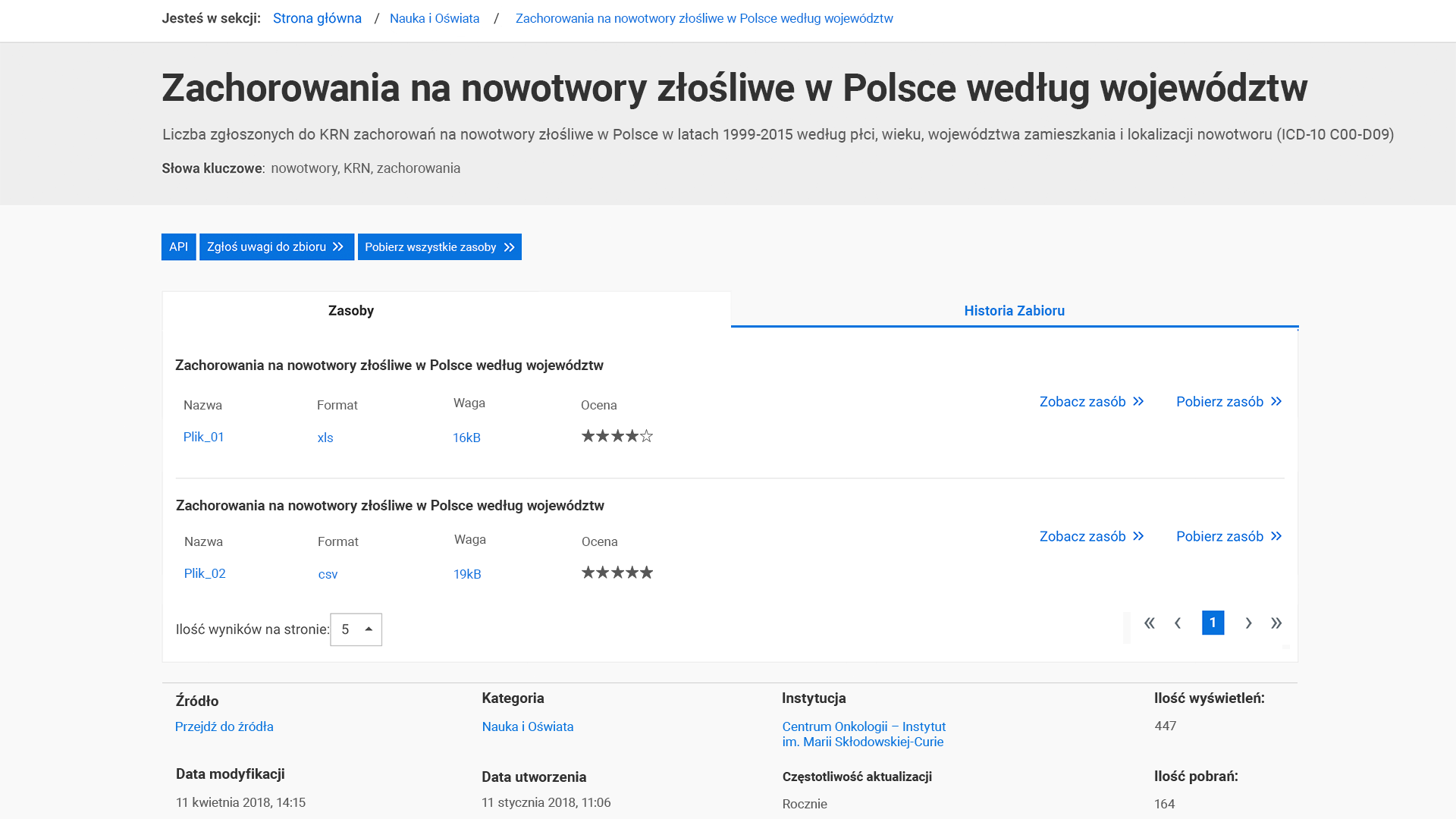
Before
Pages had no breadcrumbs, no information about the file (it's size, format or even name), the details visible on the left side can be shown or hidden on demand which doesn't give any value to the user. These information are crucial to judge if the provided dataset is up to date or who created it.
Users can't vote if the data quality is good or bad which Ministry wanted to have.
Texts that looked like links weren't actually links and button "download" redirected user to the next site with file details and only there it could be dowloaded. When one page had more than one dataset there was no possibility to download all the files with one click. Instead they had to click on each and every file - sometimes dozens of them.
After
We added breadcrumbs, adjusted font size and contrasts between grey colors.
The side menu was permanently moved to the bottom of the site. Users now can see full details about the files. Its name, size, ratings and sources with dates and providers. No additional clicks needed so keyboard users or screen readers can navigate through the site without additional effort. If our user decided to change font size in the top menu, everything is sizing perfectly thanks to the white space we left in basic version.
We added "download all files" button and we made sure that every link-looking text is actually a clickable link that redirects user to the expected card.